This blogpost was written by Fabiano Meneghetti, Head of Design at Birdie.
First, a recap after 6 months at Birdie
And the pride to be part of what we’re building
I wanted to share a recap of my six months as Head of Design at Birdie. When I first joined the team, Birdie had almost finished an MVP to put on the hands of some people before building the real product that would go to the market.
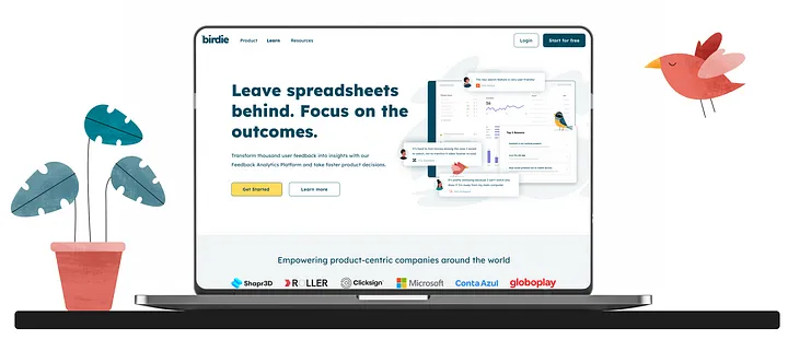
For those who may not be familiar, Birdie uses Artificial Intelligence (AI) and Natural Language Processing (NLP) to transform countless customer feedback into quantifiable evidence to be combined with behavioral data and used as a strategic input for product strategies and decisions – reducing the uncertainty of product decision-making.
But getting back to the story, it was clear that the visual identity needed a revamp. After a couple of years, we felt we’d outgrown what we had and that it was time to bring a fresh and modern look to reinforce what drives us: empowering product teams to make better and faster decisions by leveraging the voice of the customer at scale.
Birdie’s old logo
We also wanted to reference our home country and its diversity with the colors and illustrations that are now part of our identity. So we made a plan to start building a solid foundation by rebranding and designing the new product vision.
The first step was the rebranding project, which was no small feat. The logo for birdie.ai was designed with a specific goal in mind: to evoke the feeling of a bird whispering something in your ear. We wanted the logo to convey a sense of trust and reliability, as if the bird was sharing important information – something you can not only rely on but also that helps and gives you direction.
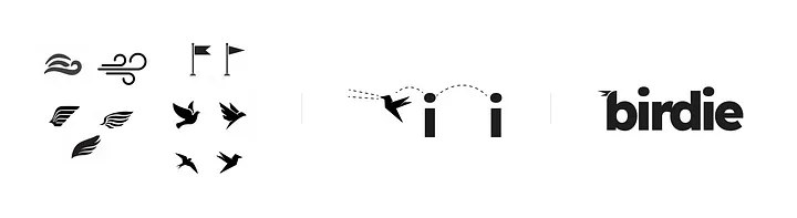
Behind the logo story composition
To achieve this, we opted for a simple yet memorable design featuring a bird with its beak slightly open, as if it were in the midst of communicating. The bird’s soft, curved lines gives it a friendly and approachable appearance, while the use of a bright, cheerful blue color adds a touch of playfulness.
On top of that, it also invokes a sense of speed and easiness, almost as if it was propelling forward and to the right direction; these are all feelings and benefits that we aim to give to people using Birdie.
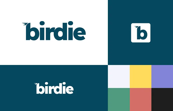
Overall, we’re thrilled with how the logo and colors turned out. It perfectly captures the essence of our brand and conveys the message that Birdie.ai is a trustworthy, reliable source of information and insights based on the combination of user feedback and segmentation data.
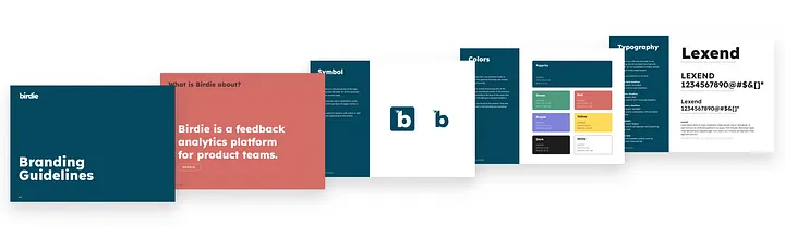
Now, I’m proud to announce the new Birdie brand and visual identity.
Also the set of illustrations from Rafa Harger gives personality and a fresh new look and feel that breathed new life into the company’s visual identity.

Set designed exclusively to the new identity and to bring the Creator archetype that we aim to be.
In parallel with the rebranding, we kept collecting feedback from the MVP and started designing the new UX vision. When it comes to building a product like Birdie, feedback is crucial. That’s why we worked closely with our design partners throughout the entire process. By collecting feedback from them, we were able to make sure that the new UI and UX were not only visually appealing but also getting close to their jobs.
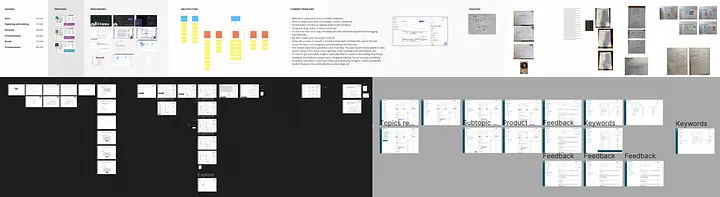
Just a sneak peak of the hard work on the new product (more of this long story soon!)
The objective was to create a new experience that would be a game-changer for Birdie. So once the UX design was finalized, it was time to build the new UI based on the new branding. From there, it was a matter of continuous delivery, making small improvements and tweaks here and there as needed. Be sure that when the new product is released I’ll talk more about this whole design process.
Looking back it was an intense journey but as I said this is just the beginning, what we made was the foundation to the big thing we’re building here. All the team is already hard at work to finish the first version of the product that will be launched soon. I’m excited about what’s to come, and I hope you are too!
If you’re as excited as I am, I invite you to request a demo. We can’t wait to show you what we’ve been working on. Thanks for reading and don’t forget to give a look at birdie.ai.
Related Posts
4 Steps to Leverage Qualitative Data to Improve Customer Satisfaction and Reduce Support Cost
After multiple iterations of our own methodology to help our customers increase their customer satisfaction [...]
Leveraging Customer Feedback Analytics to Enhance Customer Experience in FinTech
Leveraging Customer Feedback Analytics to Enhance Customer Experience [...]
Navigating the Path to SaaS Success: Insights from Henrique at Bill.com
In the fast-paced world of Software as a Service (SaaS), success isn’t just about building [...]
Product Leader’s First 180 Days: Insights from Esteban’s Masterclass on Scaling Product and Teams
In the ever-evolving landscape of product development, effective leadership can make all the difference between [...]
Leveraging AI and Behavioral Economics for Community Building and User Engagement
Today it’s really important for businesses to create active online communities and get users involved. [...]
From Product Management to the C-Suite: Navigating Your Path to Leadership
The journey from a product management role to a leadership position in the C-suite is [...]
Building and Scaling Feedback Loops for Effective Product Development
In the dynamic world of product development, feedback is the lifeblood that fuels innovation and [...]
Successful Product Discovery: 4 Key Insights from a Sr. Product Manager at Miro
Successful Product Discovery [...]